Kinder’s
Barbecue, the California way.
Kinder’s began as a California meat market and butcher shop and grew over three generations into a much larger retail food brand. As the product side of the business expanded, it needed a packaging system that could bring consistency across an increasingly broad lineup.
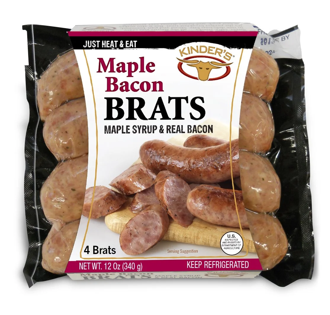
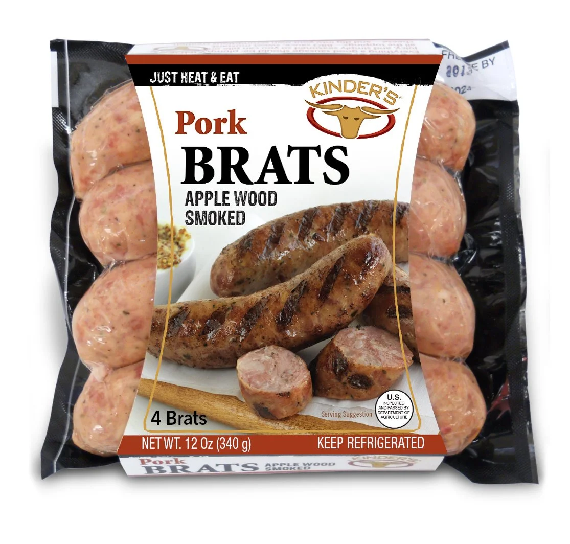
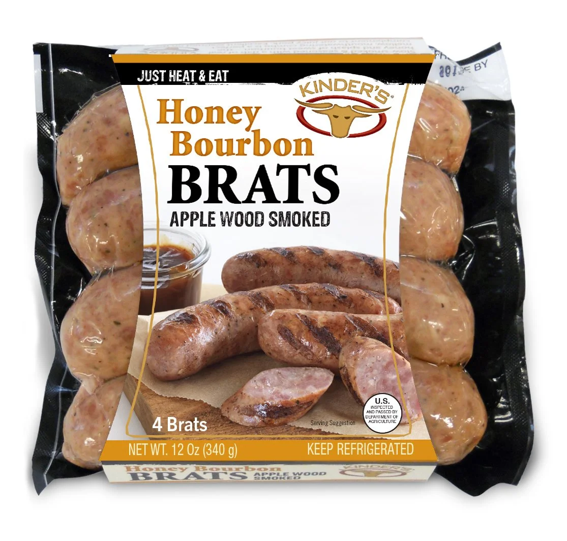
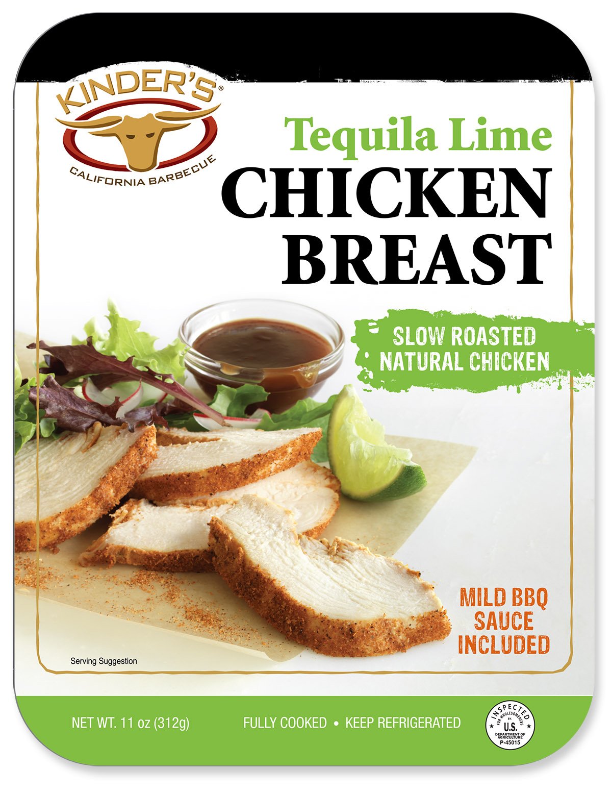
The new direction was intentionally light and white—a sharp departure from Kinder’s traditionally black packaging and from much of what was already competing on the shelf. I developed a flexible architecture that could extend across dozens of products while still giving each line its own presence.
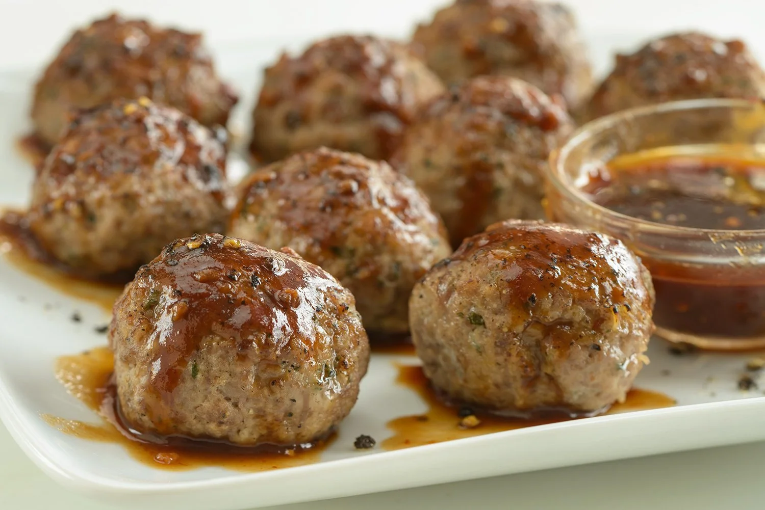
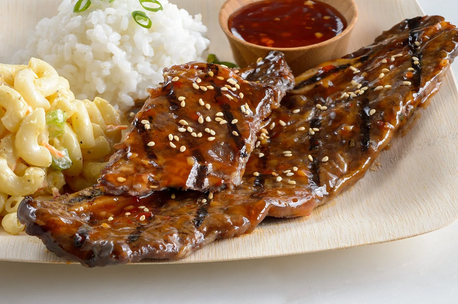
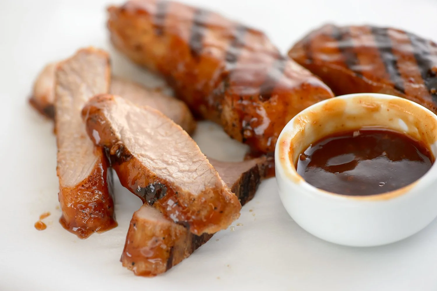
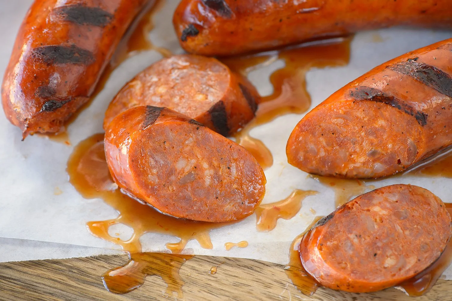
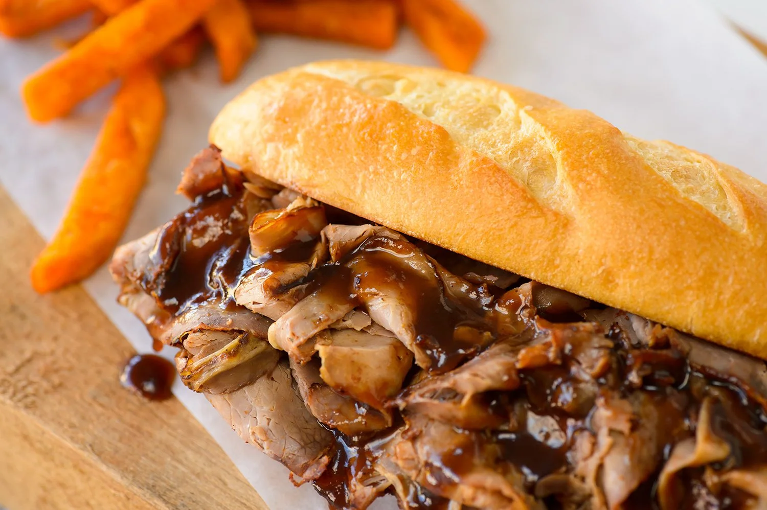
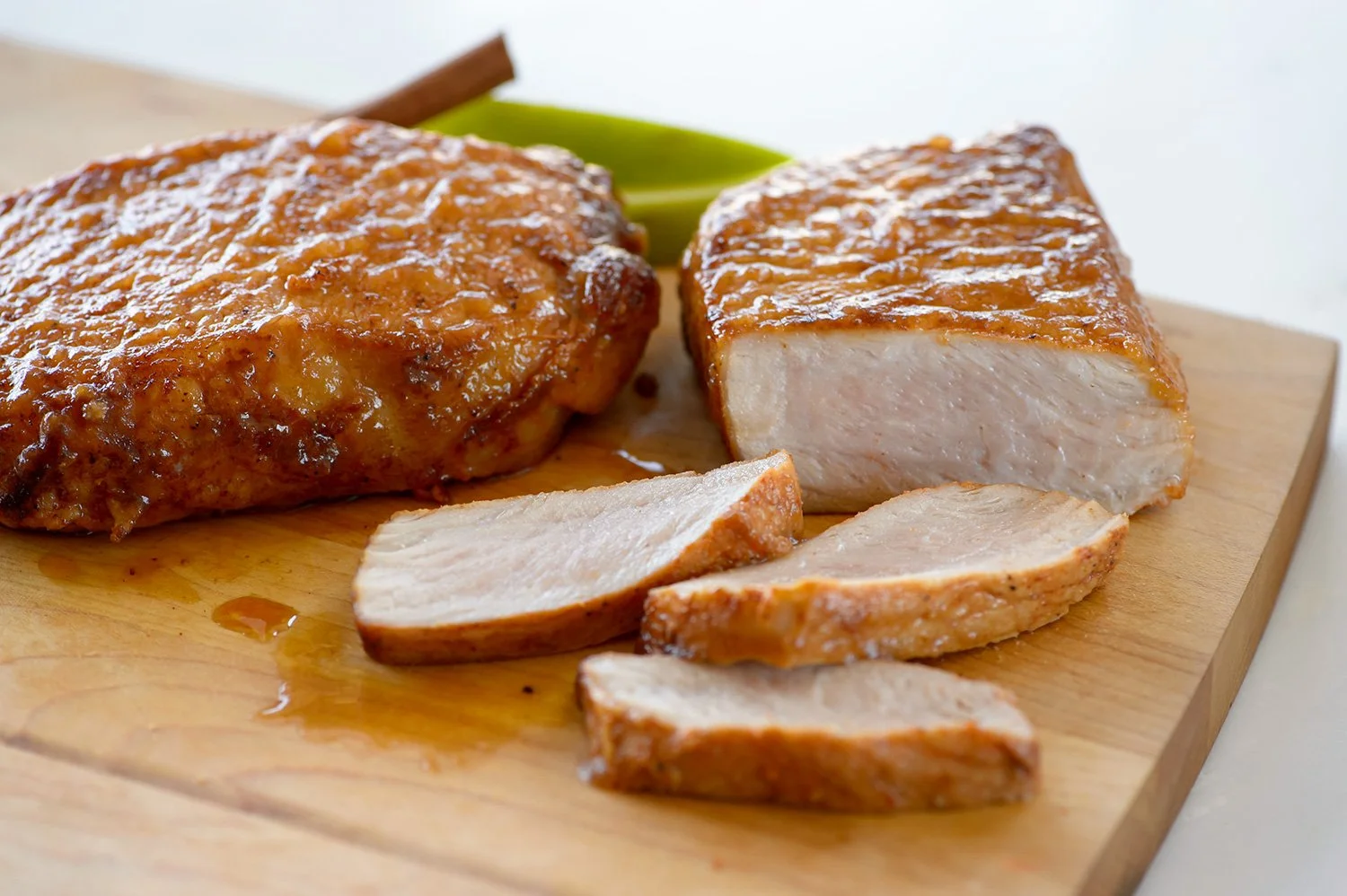
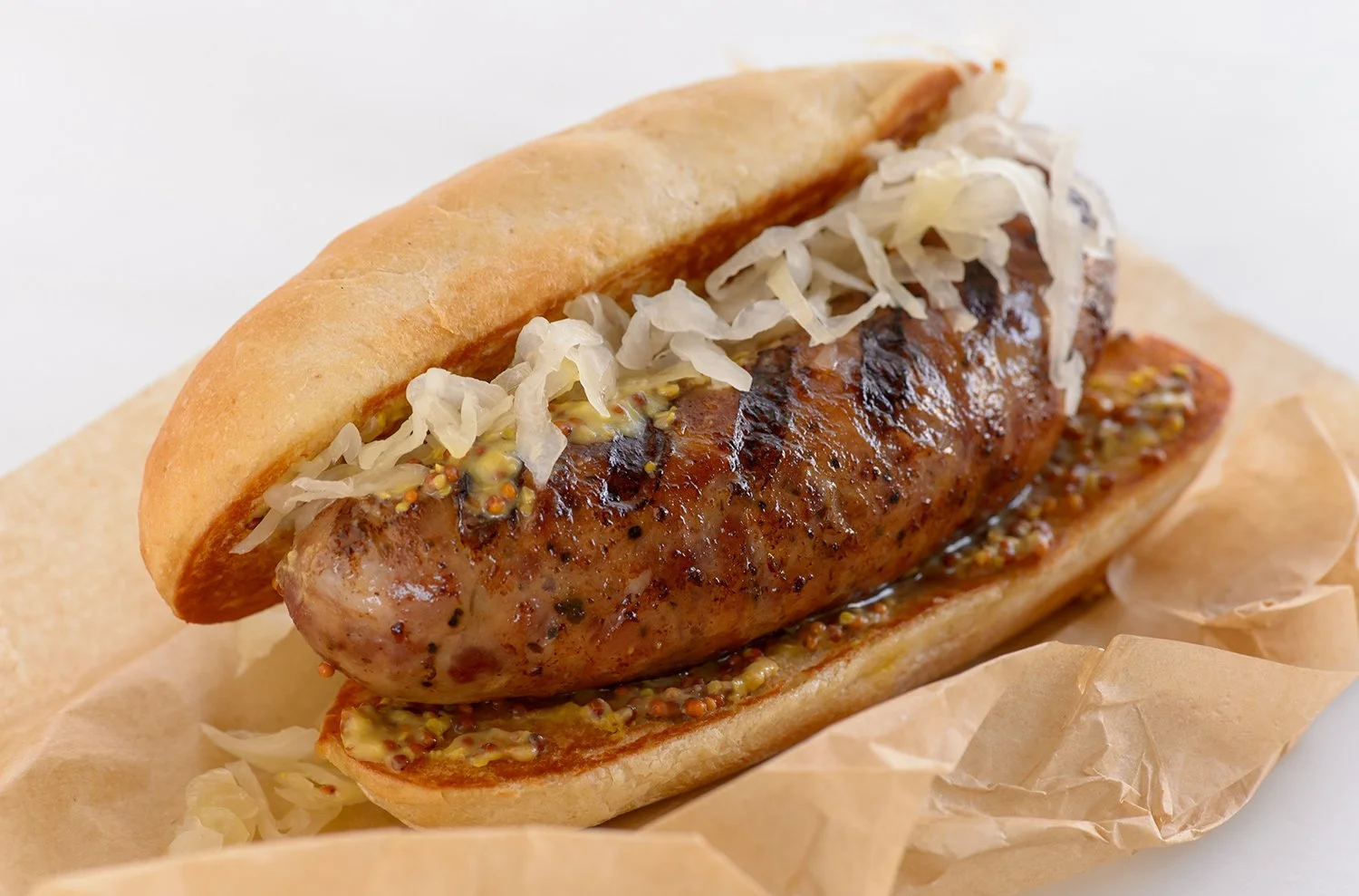
Working with a local photography studio, I art directed the product photography and applied the new look across sauces, rubs and seasonings, frozen products, brats, and the fresh Carver line of meats.
It was a lot of packaging. And a lot of meat.
Fresh Carver Line
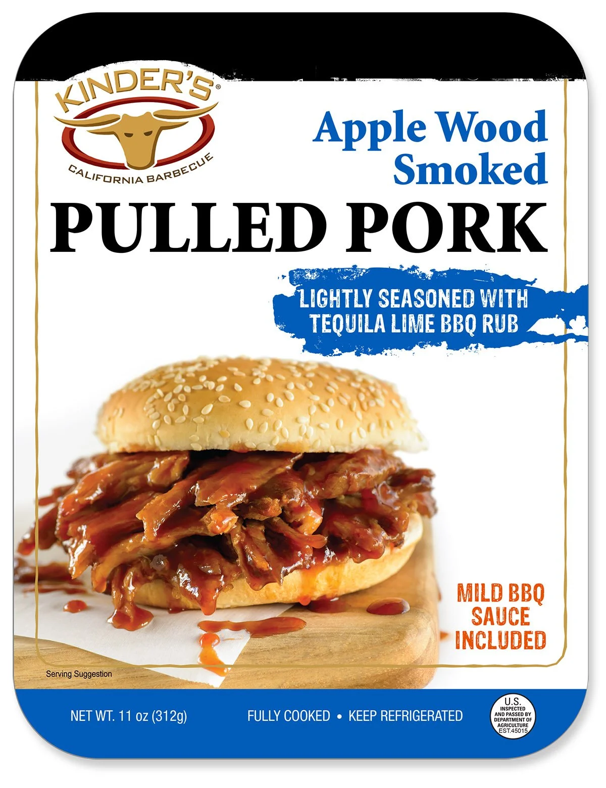
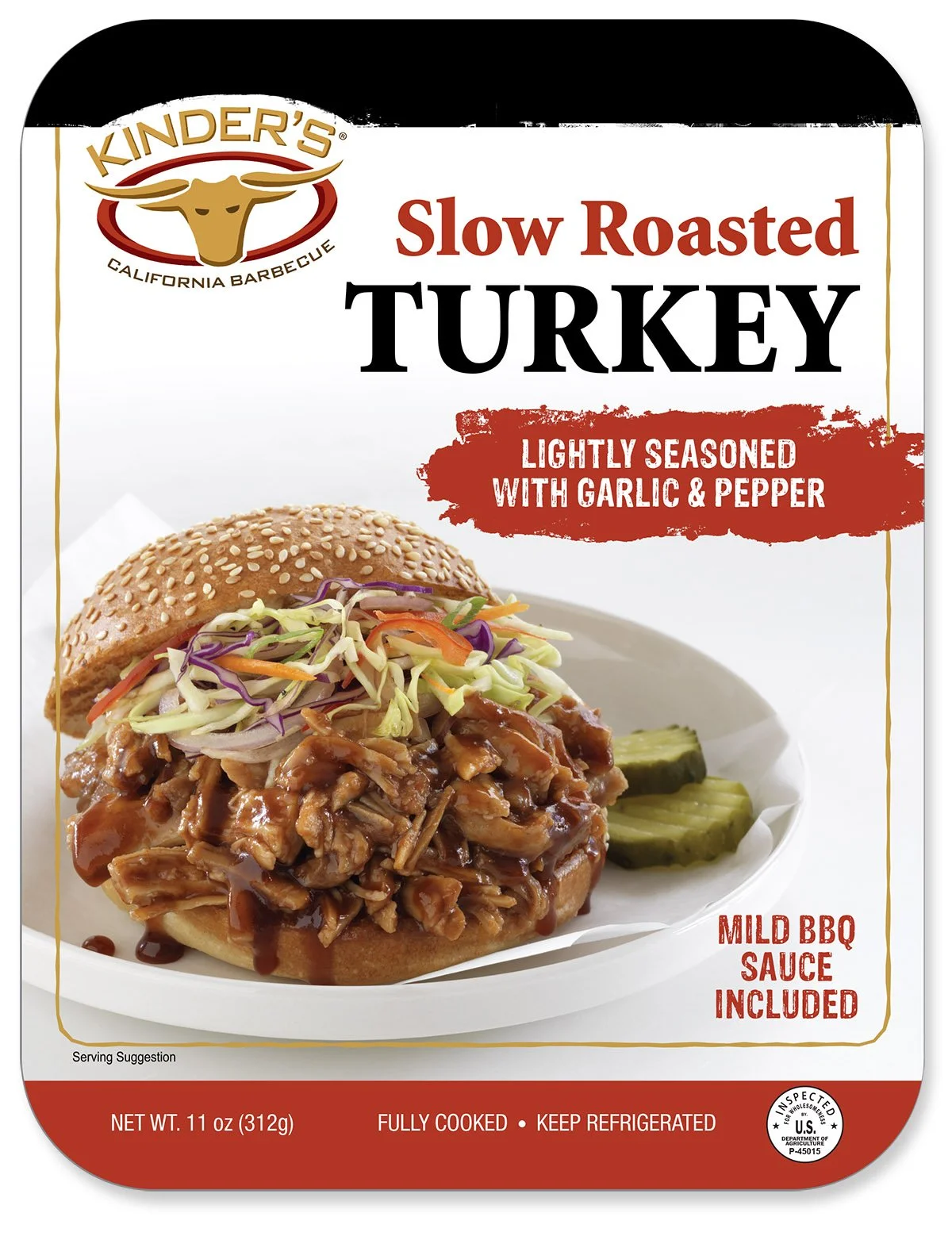
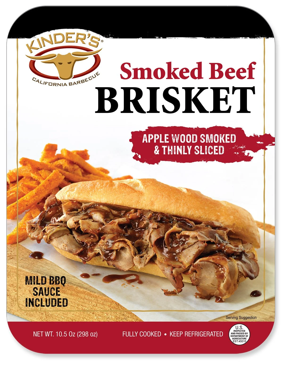
“A Beautiful Mess.”
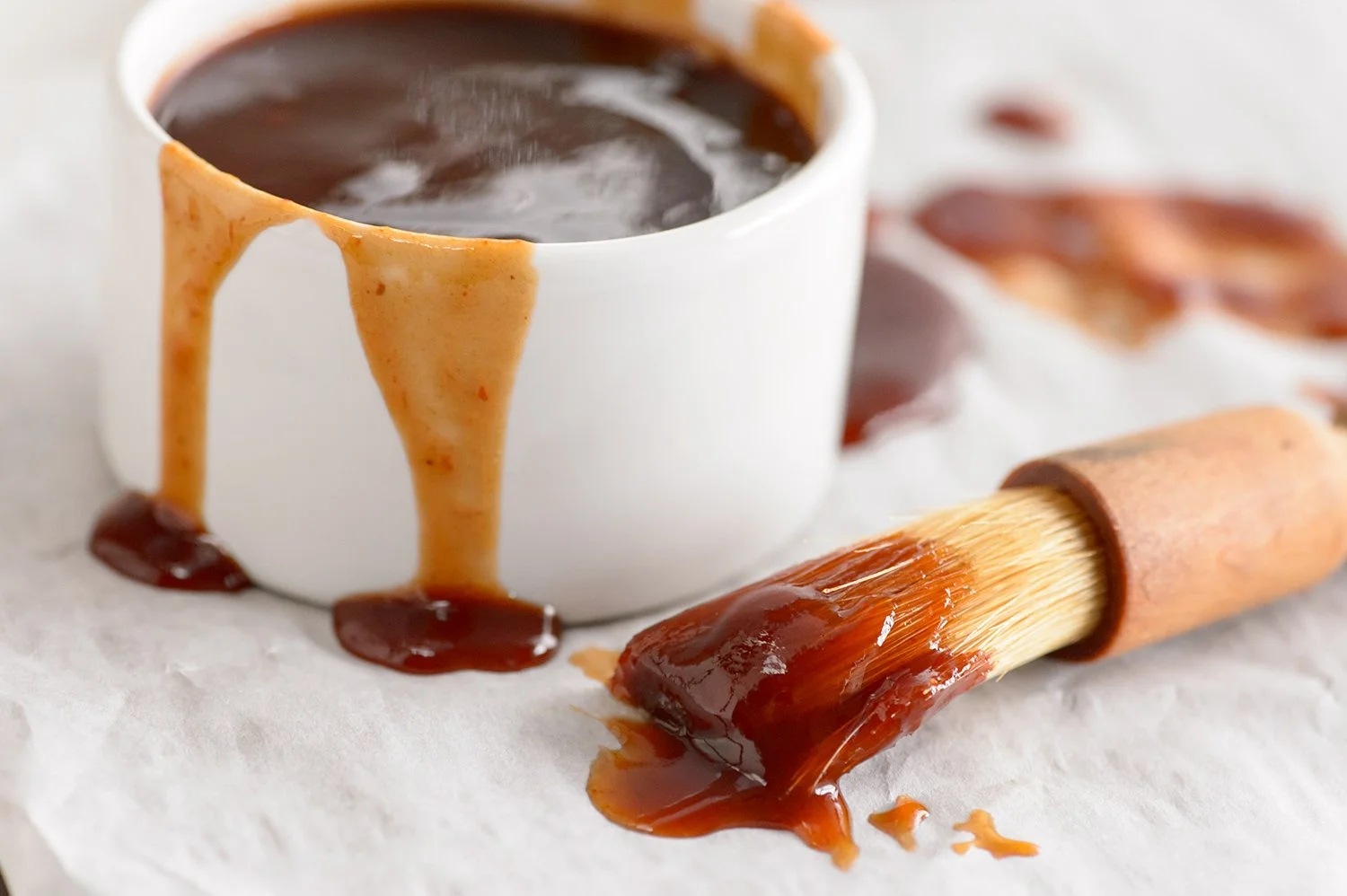
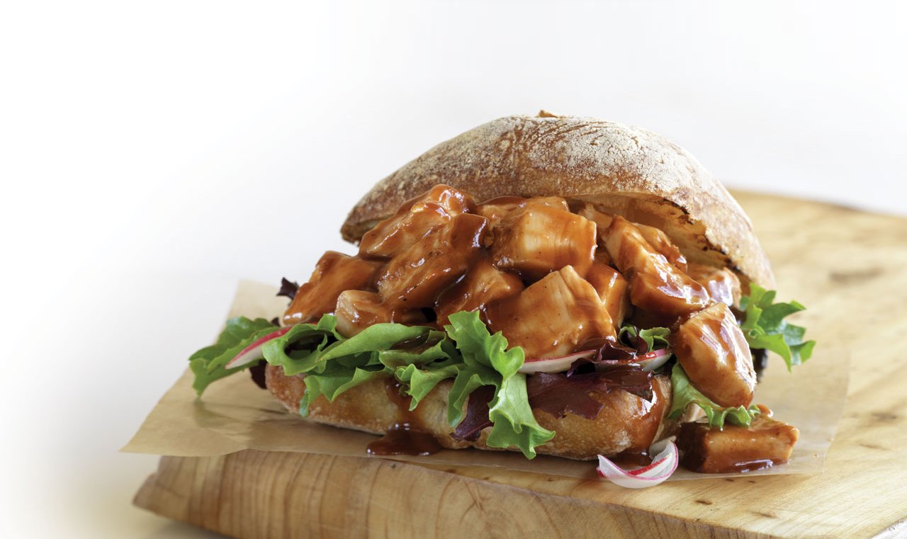
Kinder’s signature barbecue sauces became a prominent part of the photography direction. The client wanted the food to feel generous, saucy, and a little unruly—a “beautiful mess” rather than something overly styled or precious.
Sauce dripped, pooled, and coated the food, adding appetite appeal and personality while giving the entire product line a cohesive visual identity.